
Clear paths
Human connections
Brand strategy, visual identity and website design for a consultancy helping Portuguese-speaking clients navigate accounting and documentation in Canada. Reiscape connected the BRS parent brand with its Accounting and Docs service identities.
- CLIENT
- BRS SOLUTIONS
- SECTOR
- Accounting · Documentation services
- OUR ROLE
- Brand strategy · Identity · Website · Brand photoshoot
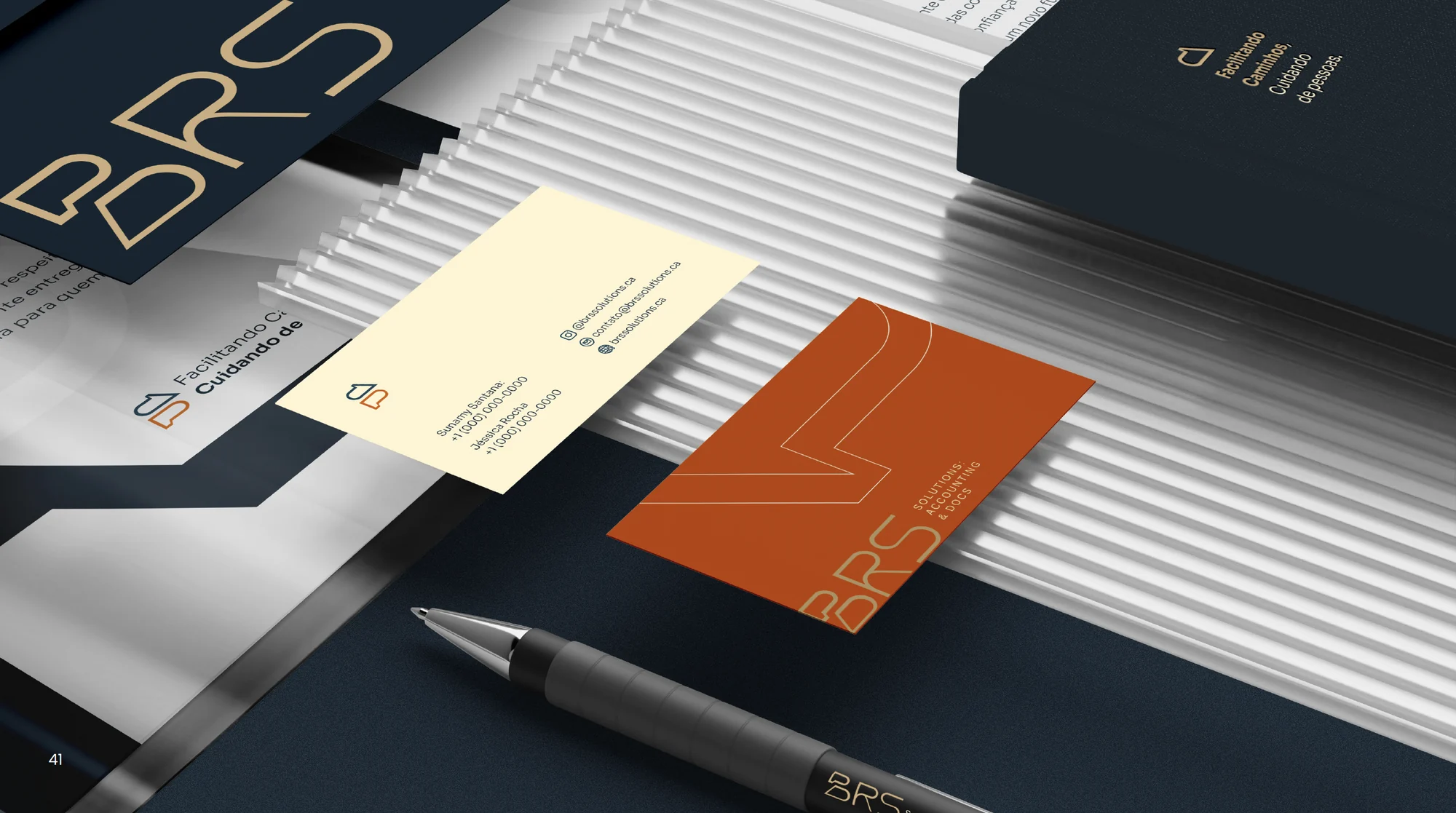
Make a complex offer
feel clear
Jéssica and Sunamy built BRS around a belief: bureaucracy should not stand in the way of a new beginning. For people starting over in Canada, unfamiliar tax and document processes can bring uncertainty. The founders wanted professional expertise and empathy to work together, making those processes clearer and more manageable.
The brand needed to make that promise visible. Two service lines address distinct needs: Accounting supports tax and financial organization; Docs helps with documentation and administrative processes. Our challenge was to give each a clear place within one trusted, approachable business.
Two service lines
One trusted brand
We organized the business into Accounting and Docs. Accounting focuses on fiscal and tax needs; Docs focuses on document and administrative support. Each has a clear identity, held together by the BRS parent brand.
From positioning and visual identity to the website and a branding photoshoot, the work is grounded in a simple idea: making paths easier while caring for people.
Direction
Conversation
The BRS symbol brings listening and action together. A speech bubble represents accessible communication and care; an arrow represents direction, initiative and solutions. Joined in one mark, they express the relationship at the heart of the business: a client is heard, guided and supported.
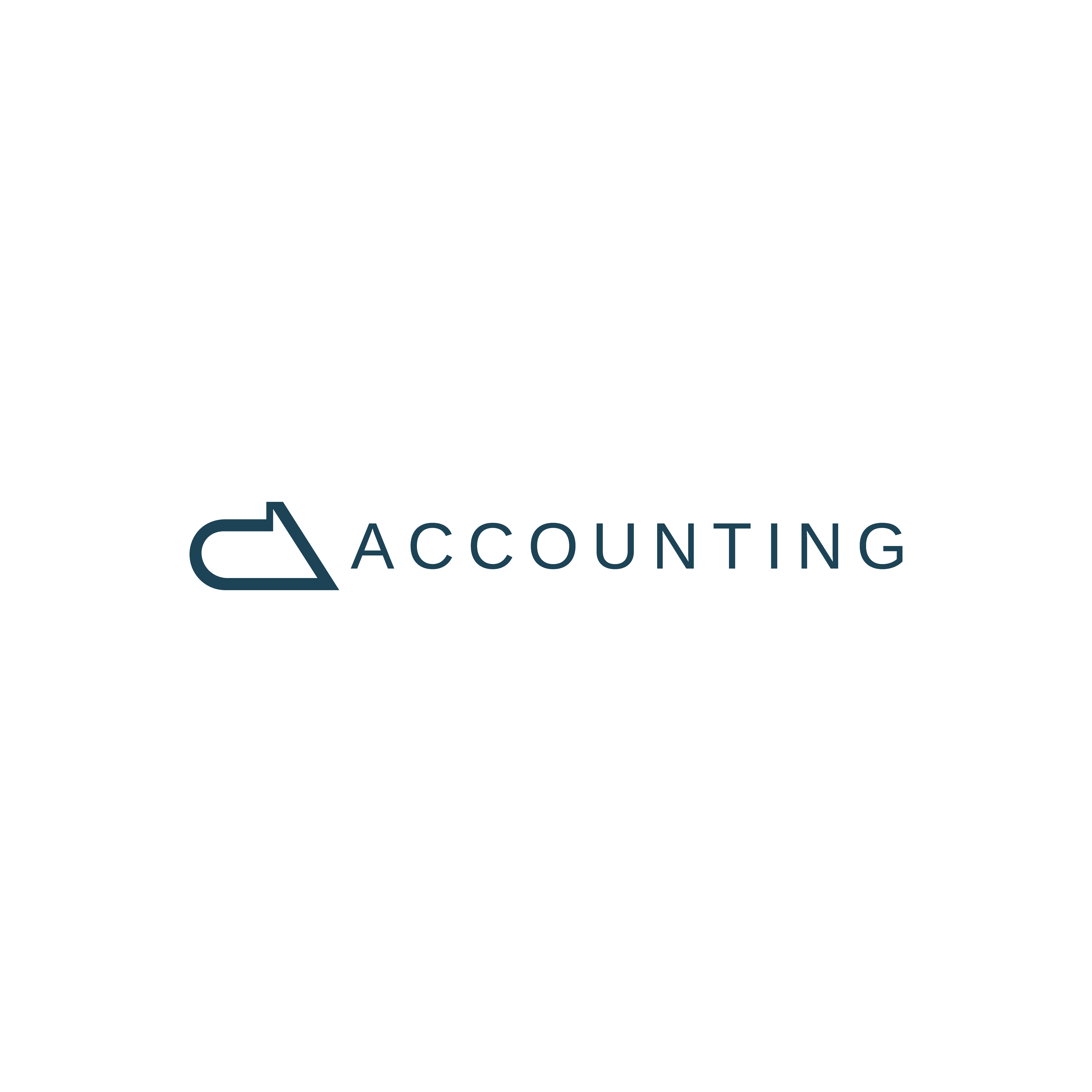
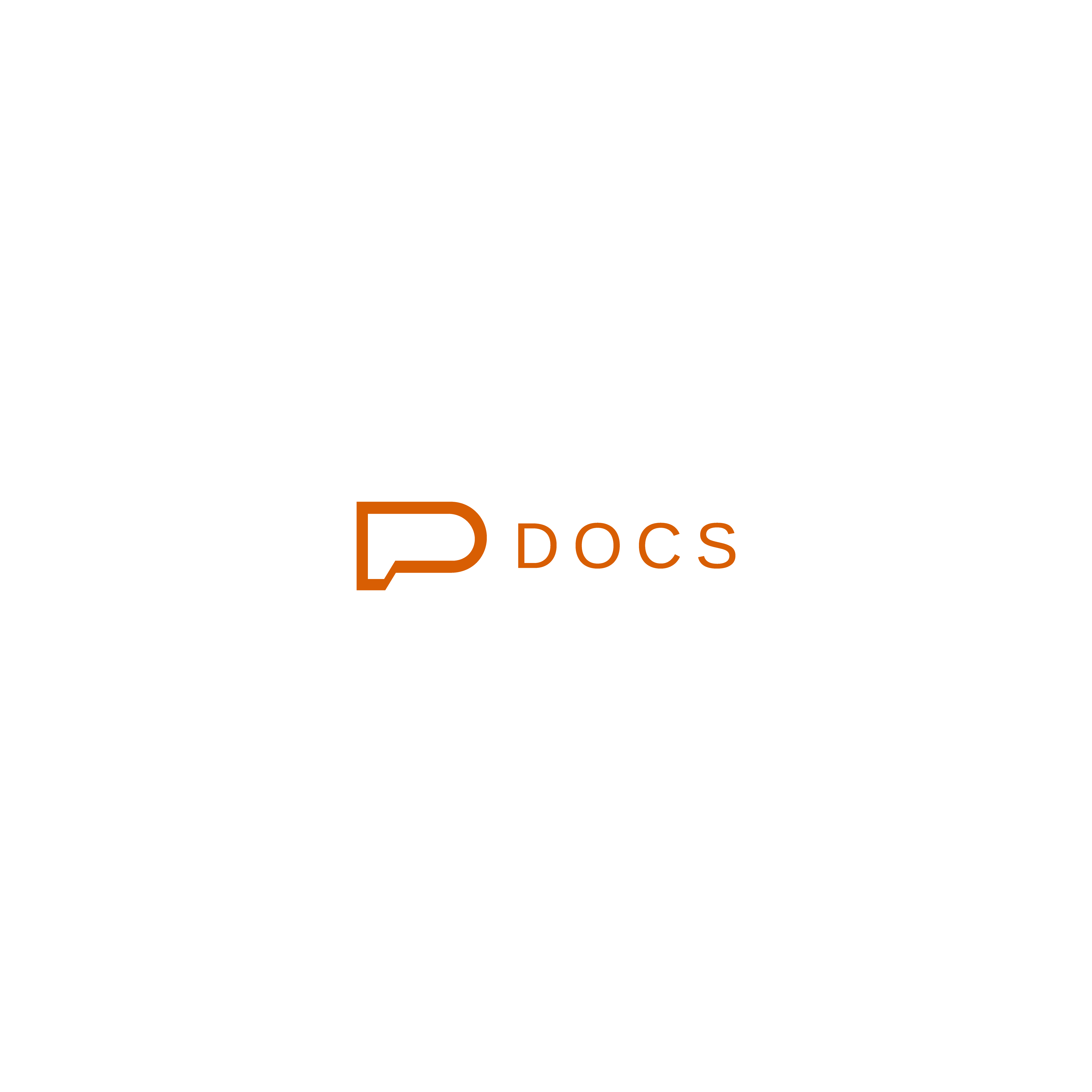
Those ideas extend into the service identities. Accounting uses the arrow and blue; Docs uses the speech bubble and burnt orange. Custom geometric lettering balances technical precision with rounded forms, bringing warmth to the parent brand.
One identity
New ways to move
The logo animations bring the parent brand and its two service lines to life, from the first strokes of each symbol to the complete signature.
Easy to understand
Easy to recognize
Accounting
A dedicated identity for accounting, tax and business support.
Docs
A dedicated identity for documentation and administrative processes.
Shared forms and typography connect the two. Colour helps people distinguish the service they need.
The same clarity
Online
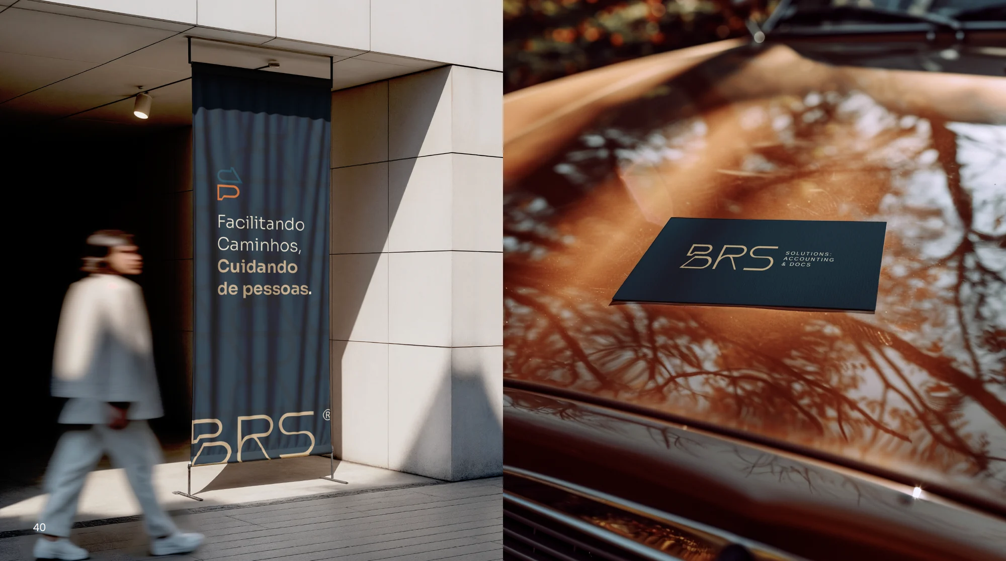
We carried the brand into a new website, bringing Accounting and Docs into clearly defined service areas and helping visitors find the information and contact route relevant to them.
The result is a coordinated brand across the website, photography and printed applications: professional in its delivery, approachable in how it welcomes people. Visit the BRS website
Expertise, with
a human face
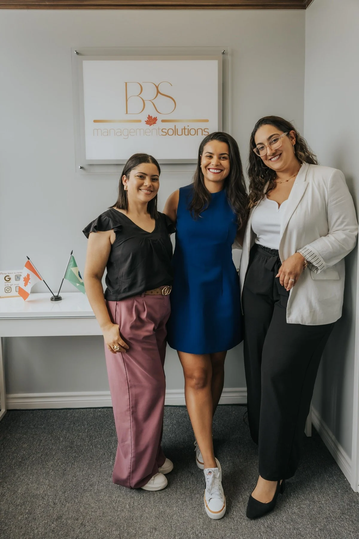
We created a repositioning branding photoshoot with BRS founders Jéssica and Sunamy. Portraits, shared moments and images in Toronto brought the people behind the services into the brand, connecting professional expertise with the approachable, personal care at the heart of BRS.





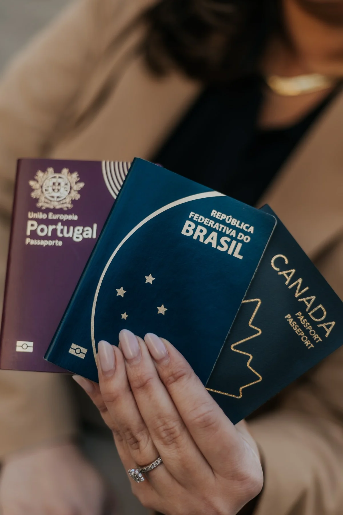
Explore the session with the arrows or swipe.
A new chapter
Built from the inside
Renata with Jéssica and Sunamy at the start of their BrandCore journey, preparing the next chapter of BRS Solutions.
A brand that grows
with your business
Ready for your next chapter?Let’s talk about what’s changing in your business and how your brand can move with it.
Book a Discovery Call